Home > Arts > Artists > M > Gerardus Mercator
Mercator map projection, diagram

![]()
Wall Art and Photo Gifts from Science Photo Library
Mercator map projection, diagram
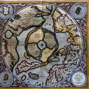
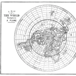
Mercator map projection. Diagram of an Earth globe (left) and a Mercator map projection (right) with the blue strip (from South America to Greenland) showing how the spherical surface is projected onto a cylindrical map. The arrows (blue) show how the polar regions are narrower on the globe, and wider on the map. This is one of the disadvantages of this projection, which distorts the polar regions compared to the equatorial regions. Greenland and Antarctica appear much larger on the map than on the globe. This standard projection is named for the Flemish geographer and cartographer Gerardus Mercator who used it in 1569
Science Photo Library features Science and Medical images including photos and illustrations
Media ID 6348329
© This illustration is protected by laws and international treaties, as well as other intellectual property la
Arrow Arrows Cartographic Cartography Cylinder Cylindrical Diagram Distorted Equatorial Geometric Geometry Globe Mapped Mapping Mathematical Mathematics Projecting Projection Rectangle Rectangular Sphere Spherical Mercator Projection
FEATURES IN THESE COLLECTIONS
> Arts
> Artists
> M
> Gerardus Mercator
> Maps and Charts
> Gerardus Mercator's Cartographic
> Maps and Charts
> Related Images
> North America
> Greenland
> Maps
> North America
> Greenland
> Related Images
> Science
> Space Exploration
> Planets
> Earth
> South America
> Related Images
EDITORS COMMENTS
This print showcases the Mercator map projection, a widely used method for representing the Earth's surface on a flat map. The diagram features an Earth globe on the left and a Mercator map projection on the right, with a striking blue strip stretching from South America to Greenland. This strip demonstrates how the spherical shape of our planet is projected onto a cylindrical map. The blue arrows in this image highlight one of the drawbacks of using this particular projection: polar distortion. As indicated by these arrows, the polar regions appear narrower on the globe but wider on the map, resulting in an inaccurate representation. Notably, Greenland and Antarctica seem significantly larger than their actual size when compared to other regions. Named after Gerardus Mercator, a Flemish geographer and cartographer who introduced it in 1569, this standard projection has become widely recognized despite its limitations. The geometric precision displayed in this illustration emphasizes both its mathematical foundation and artistic appeal. Through Claus Lunau's artful lens, we are invited to appreciate not only the complexities of geography and cartography but also how different projections can alter our perception of space. This thought-provoking photograph serves as a reminder that every representation comes with inherent distortions – even those as seemingly objective as maps – urging us to approach them with critical thinking and awareness.
MADE IN THE USA
Safe Shipping with 30 Day Money Back Guarantee
FREE PERSONALISATION*
We are proud to offer a range of customisation features including Personalised Captions, Color Filters and Picture Zoom Tools
SECURE PAYMENTS
We happily accept a wide range of payment options so you can pay for the things you need in the way that is most convenient for you
* Options may vary by product and licensing agreement. Zoomed Pictures can be adjusted in the Cart.